Designed
A connected overview and modular visual system.
A calmer financial overview: understand where you stand, see what needs attention and ask a better next question.
Follow the story ↓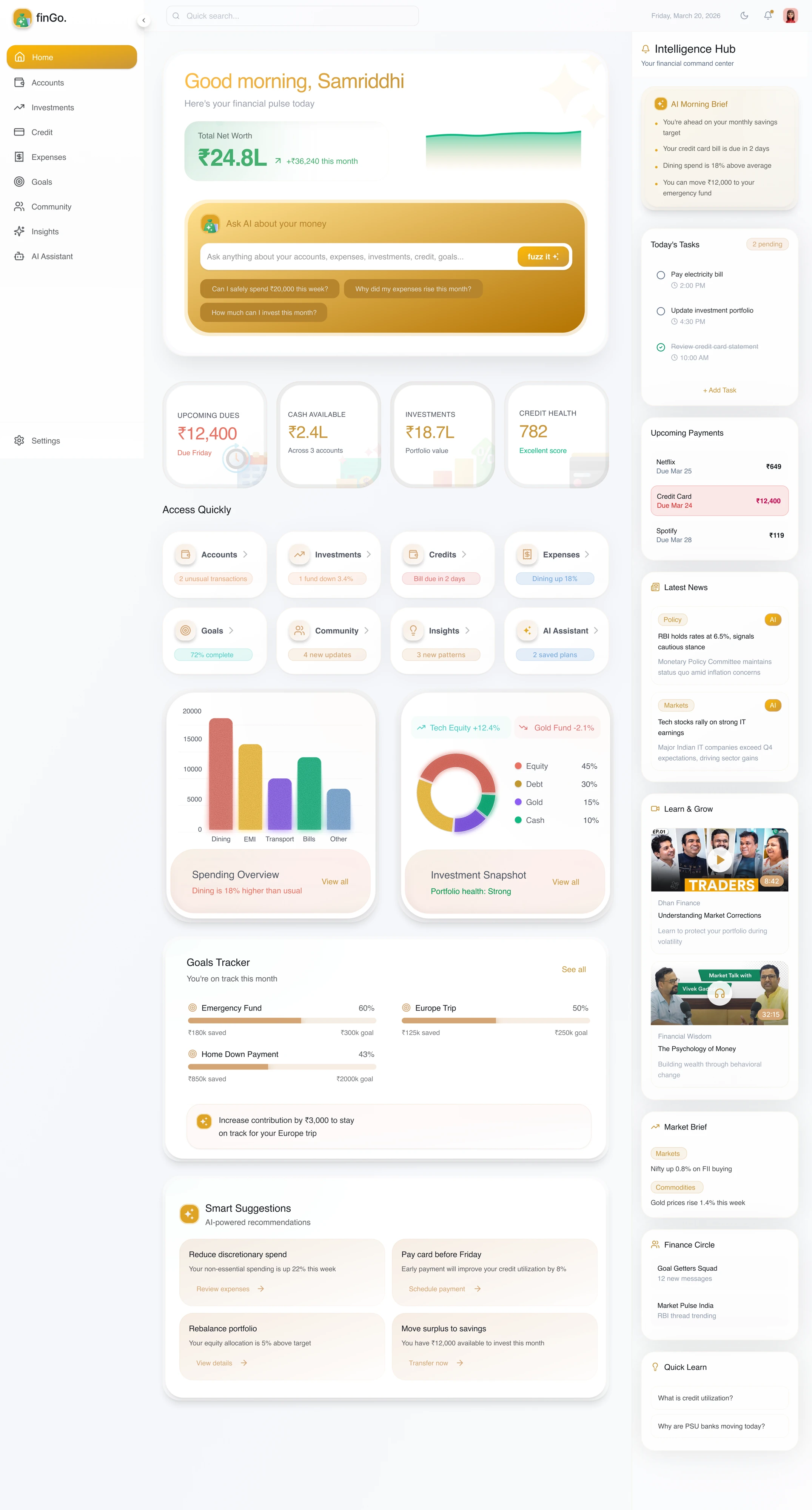
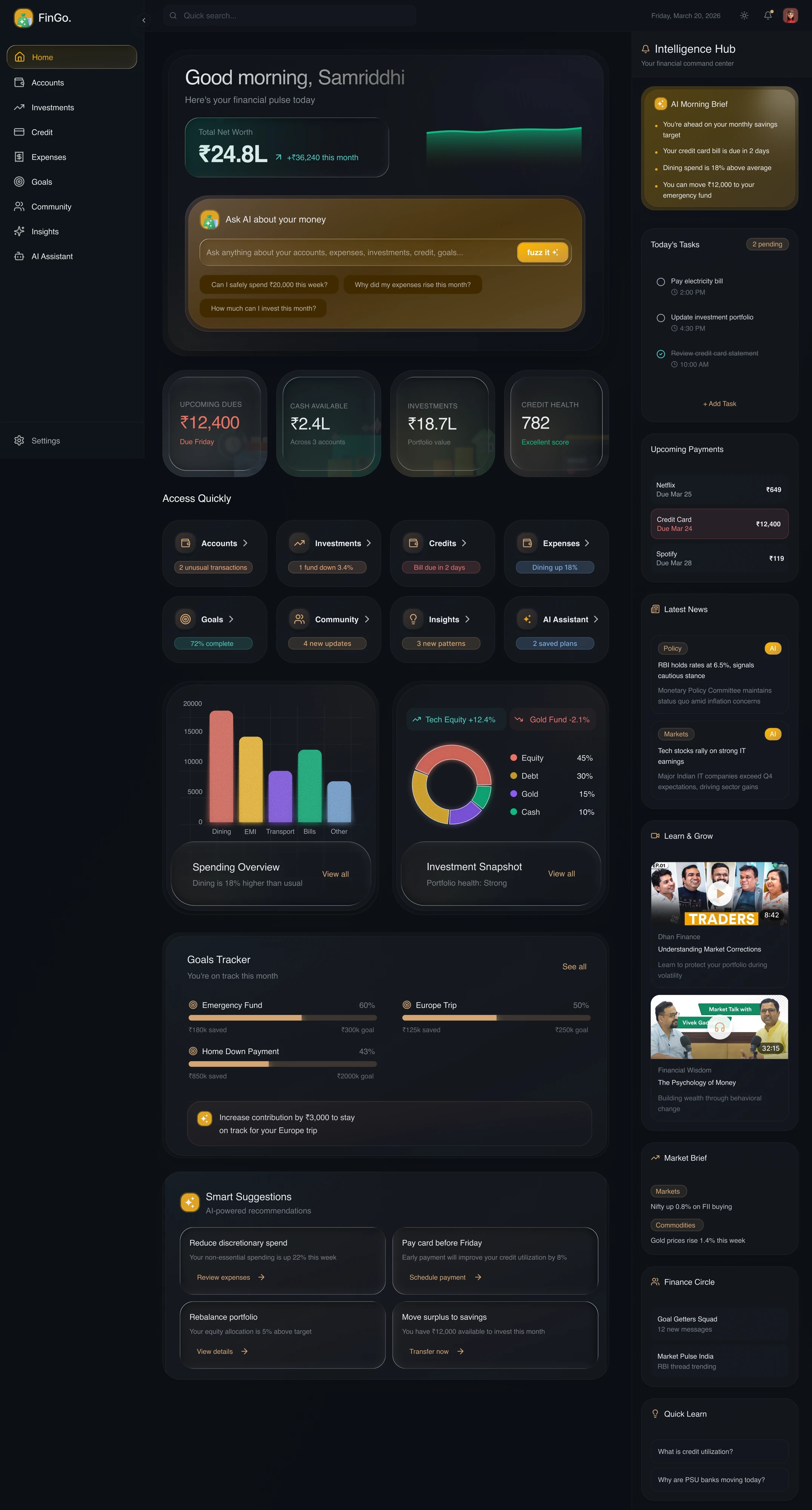
The first job is orientation: where the money stands, what changed and what needs attention.
A clear first read makes the deeper numbers worth exploring.
Balances, transactions, payments and an assistant can all compete for attention.
I gave the main workspace to the financial picture, kept questions close to it, and used the side rail for supporting signals.
Net worth and movement.
What needs attention.
Questions in context.
A relevant next step.
Net worth and recent movement establish the picture. Contextual questions sit beside the information they refer to.
The assistant supports understanding without taking over the dashboard.
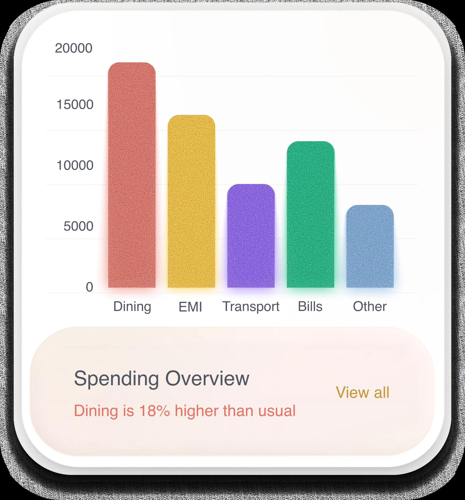
Turn individual transactions into a pattern. Let people compare categories before digging into the detail.
The chart belongs inside the financial picture, with values and labels kept readable.
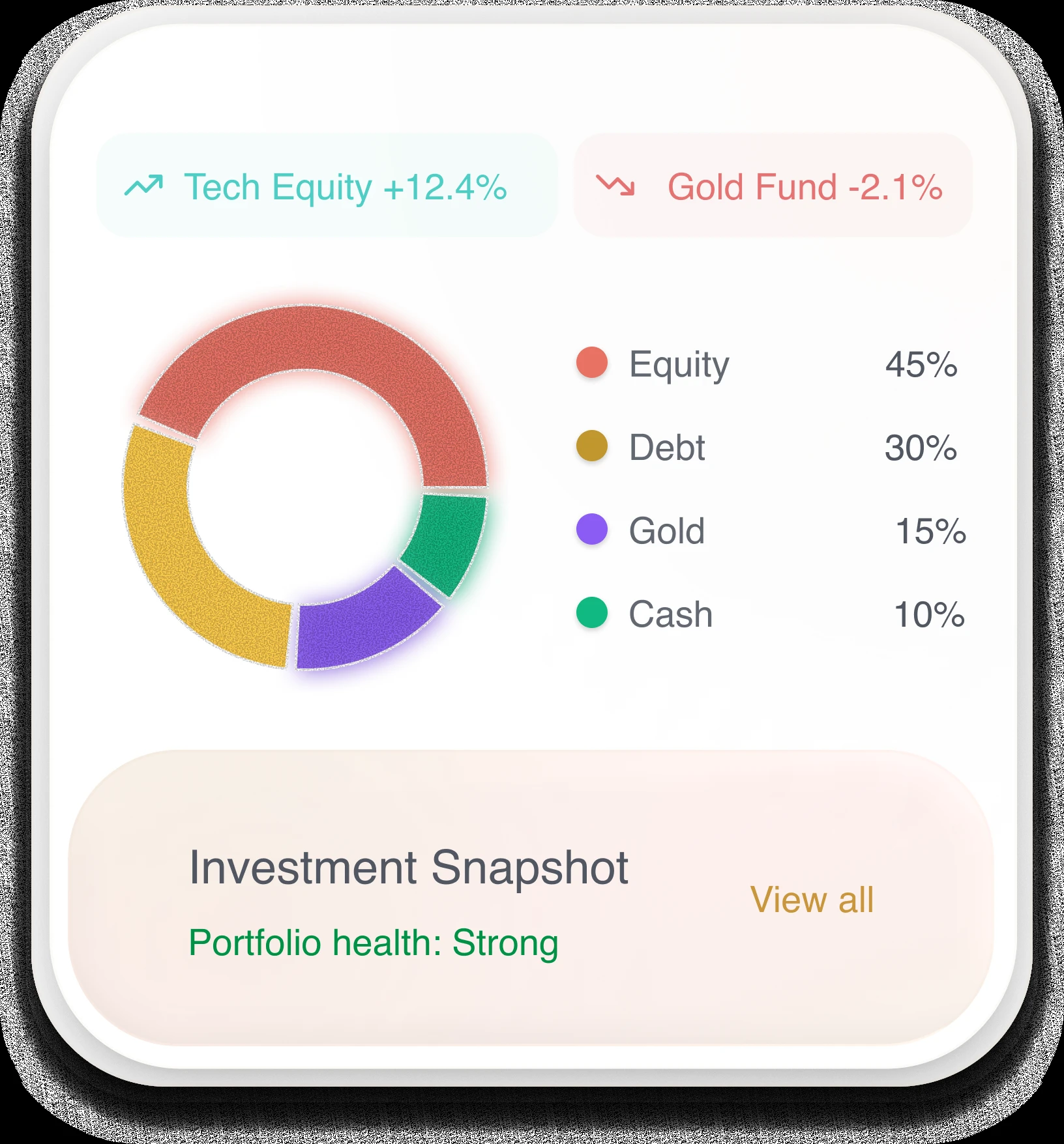
Show the balance between holdings before asking people to inspect each investment.
The allocation explains the portfolio. It does not prescribe a financial decision.
A connected overview and modular visual system.
Can people identify their position and next priority quickly?
Stale data, disconnected accounts and failed AI responses.
Concept work, not a shipped financial product. User comprehension and business impact are not yet measured.